How Climate Change is Driving Migration in Central America’s Coffee Belt

Overview
Using the power of data-driven storytelling, the project aims to increase awareness about the impact of coffee production and migration in the Northern Triangle countries, with a target audience of coffee consumers who want to learn about the story of coffee production and become responsible consumers and citizens.
Highlights
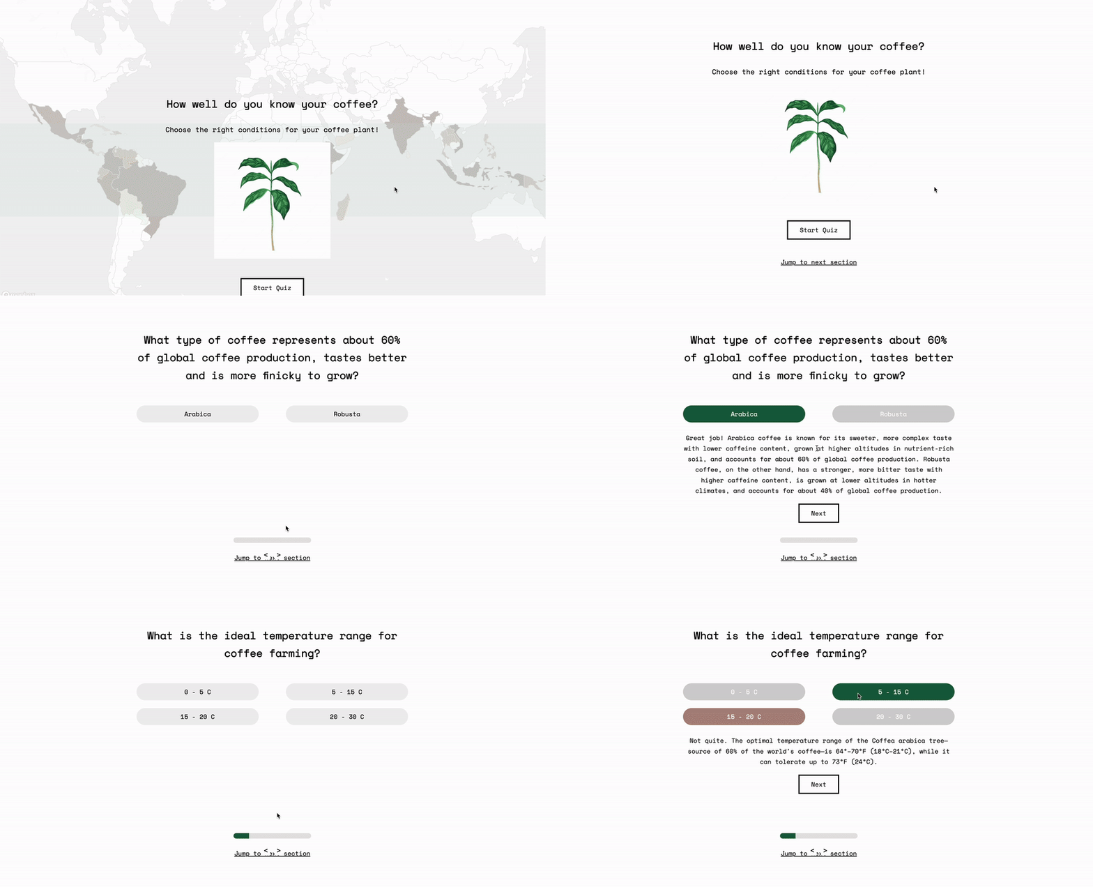
Interactive quiz
To make the experience more interactive, we added an educational quiz on the conditions needed for coffee cultivation, designed with multiple-choice questions and immediate feedback to engage users and simplify learning. This initiative prepares users for further discussions on climate change's effects on coffee production, enhancing their understanding of the challenges faced by coffee farmers in the region.

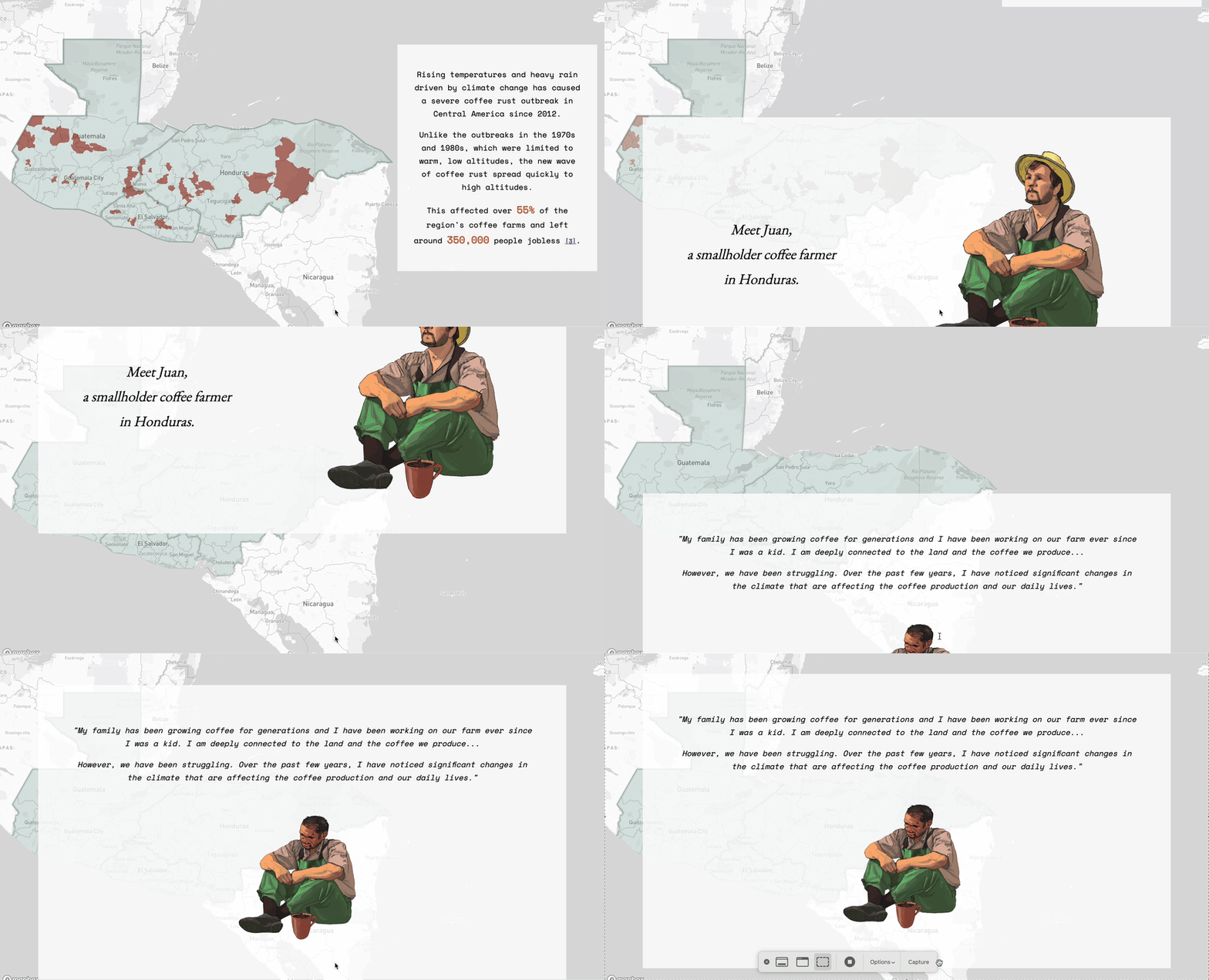
Farmer persona
In our project, we decided to feature a story of a farmer from Honduras to forge an emotional connection between our users and the narrative. Our goal was to illuminate the effects of climate change on coffee production and its subsequent impact on the farmers' livelihoods, potentially leading to migration. We hoped that by weaving in the farmer's personal experience, users could more deeply understand the journey from climate change to its effects on coffee production and migration reasons.

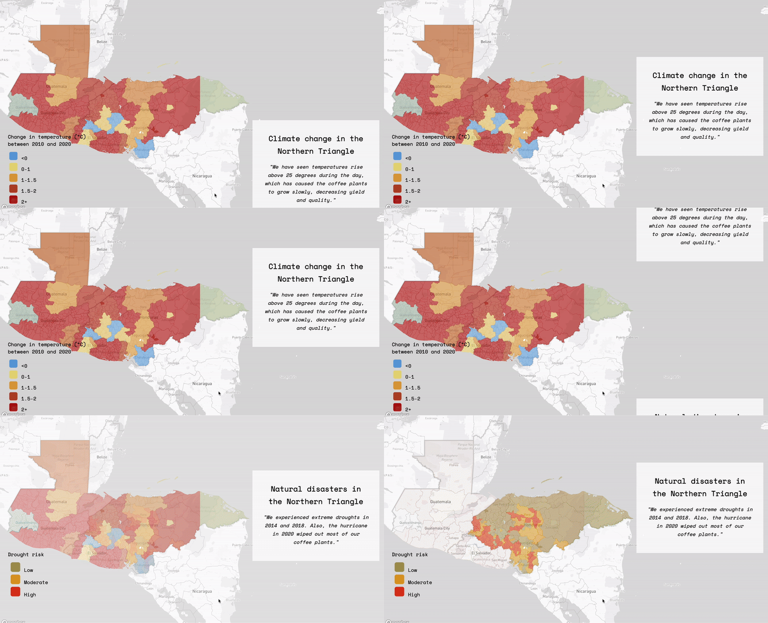
Maps and scrollytelling
The project uses maps as its main data visualization tool to highlight patterns within the Coffee Belt, focusing on three specific countries. We used Mapbox to create interactive maps to allow users to explore coffee-growing regions, examining climate data like temperature and precipitation in detail. To address the effects of climate change on coffee production in the Northern Triangle, the project employs scrollytelling and a martini glass layout for its quiz and various scenarios. By breaking down complex information into smaller, manageable sections, this approach facilitates easier understanding for a wide audience and increases engagement.

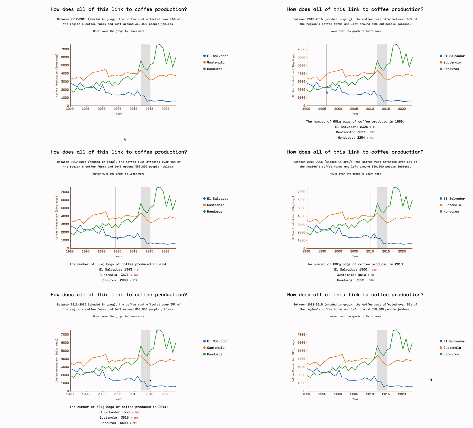
Interactive charts
Interactive charts allow for users to engage with data in a dynamic way.

Details
- When: March 2023 - May 2023
- Duration: 2 months
- Collaborators: Austin, Nishtha, Muqing
- This project was part of the course 6.C85 Interactive Data Visualization and Society at MIT in Spring 2023.